miriamkdesign.com
Telling a good story differently

CA05 Webdesign
Sushi and Chopsticks
Check out the site here:
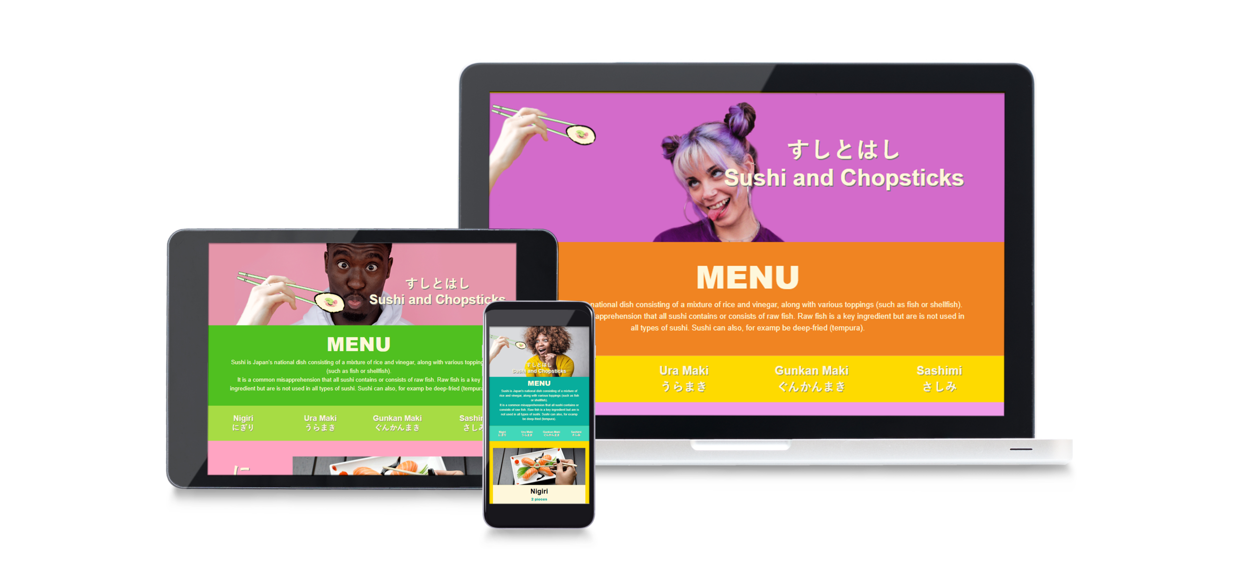
The brief was to design an online menu for a Sushi restaurant where potential customers can find contact information, book a table and see what is being served. The menu should function on multiple devices, from mobile to desktop.
The concept for the design for this sushi website was first of all to not use black, red and white in my design, which clearly is the standard for most sushi restaurants.
To give it a young and trendy style the concept is to use colours boldly, similar to designs from the 90’s (think of the intro to “The Fresh Prince of Bel-Air” sitcom) together with playful and humorous images for a light and youthful tone of voice. For simple illustrations I added the well-known Japanese style of Kawaii for some added cuteness. Could traditional sushi, Japanese kawaii and the 90’s vibe work together?
In addition to this I wanted to create 3 unique looks for the three different devices, so that the visitor would have a different experienced based on which type of device they use.
