miriamkdesign.com
Telling a good story differently

Design history
Graphic Design 4
The Graphic Design Department at Noroff needed a creatively folded leaflet for their pop-up exhibition at their Bergen campus. The leaflet focus on the graphic design from 1950-1980 covering 4 styles in particullar:
International Typographic Style/Swiss Style (ca. 1950-late 1960s)
Pop Art Style (ca. 1950-1970)
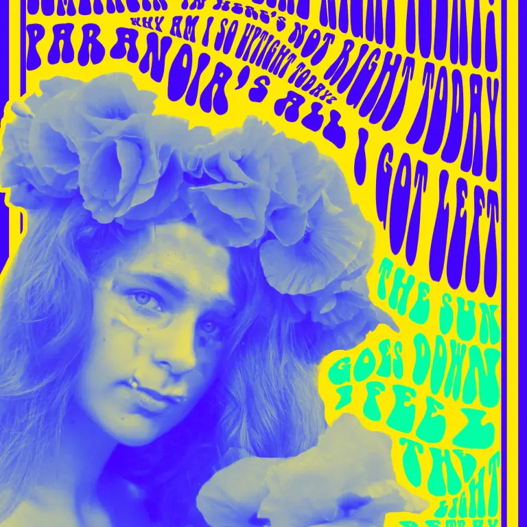
Psychedelic Poster Style (ca. 1960-mid-1970s)
New Wave/Punk Style (ca. 1970-mid-1980s)
For each period I created a visually striking graphic to represent the style accompanied by some key points of the style history, influential graphic designers and typical style traits. In addition, the brief asked for a timeline or infographic to illustrate the various periods and styles in graphic design. For easy transportation the brochure needed to be small enough to fit into a small purse, or ideally any pocket.
The concept for the leaflet is first and foremost to showcase Graphic Design history through the design of the leaflet itself and the illustrations. It also needed to clearly link to the school Noroff, which is where the square colour scheme comes in. To connect the 4 design styles further I used the lyrics from the song Papercut by Linkin Park as inspiration for the illustrations.
Dieline for brochure here:


