Strategic design 2
Brodie's books
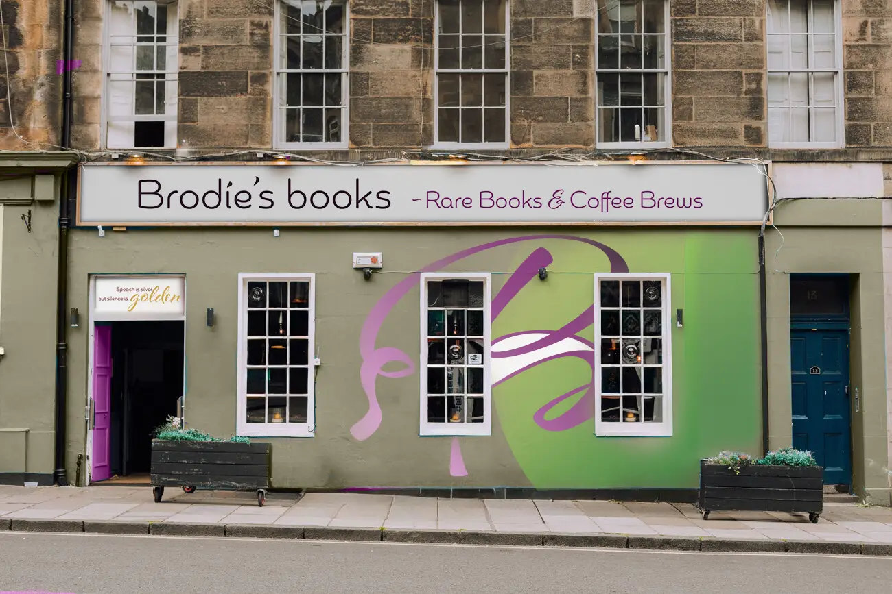
Brodie’s Books specializes in rare, collectible second-hand books and is located on the historic Royal Mile in Edinburgh, Scotland. The bookstore offers a luxury, high-end selection that attracts discerning customers from around the world. In addition to their rare books, Brodie’s also serves custom coffee brews and is dedicated to building a strong community around the bookstore—one cup of coffee at a time.
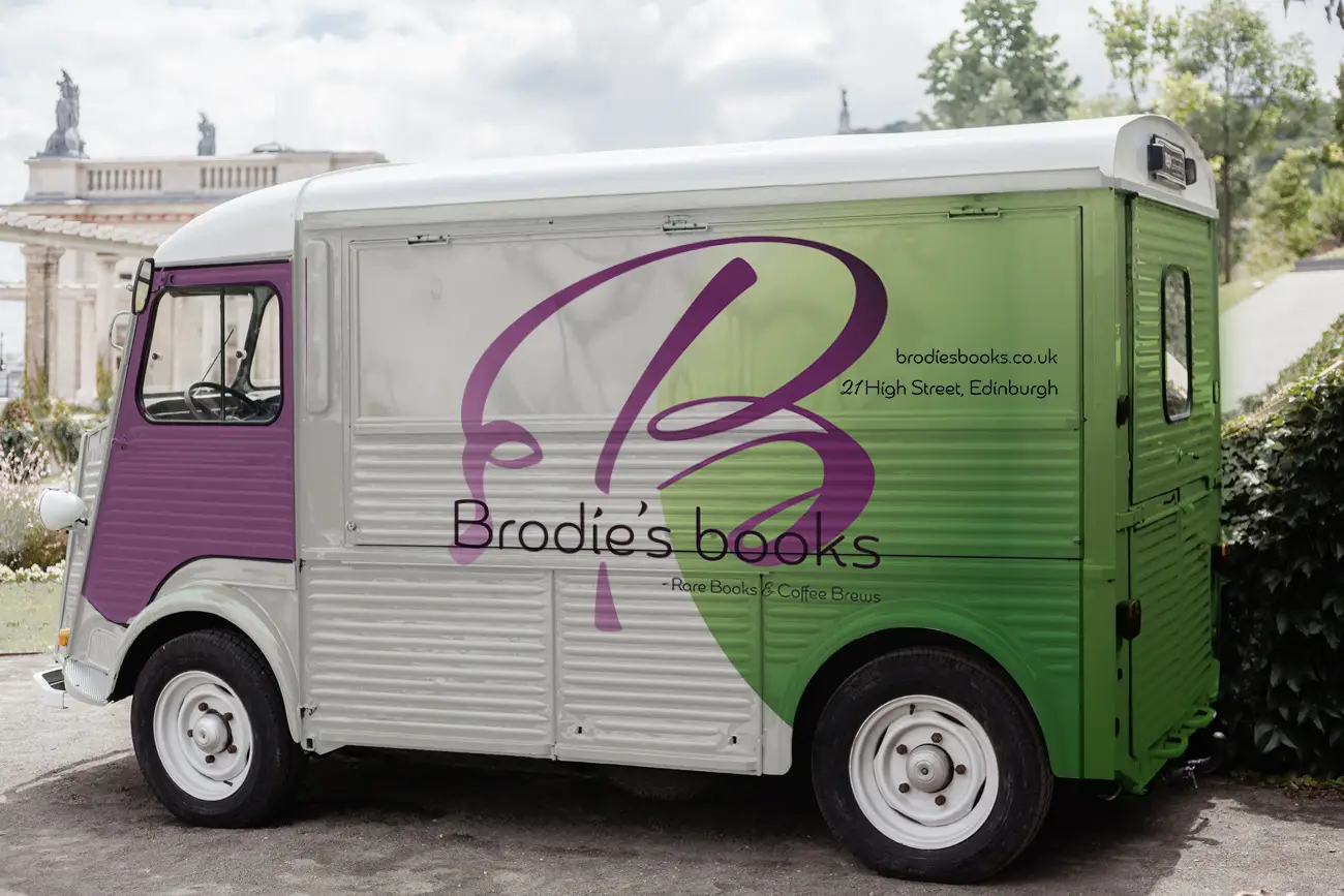
Recently, the owners of Brodie’s expanded their business by purchasing an old bar in the city center. This marks a significant transition from an online shop to a physical store, where they plan to furnish the space with beautiful second-hand furniture and establish a cozy coffee bar. This major shift in their business prompted the need for a refreshed brand identity to reflect their evolving vision.
Challenge
The main challenge was to design a simple yet distinctive logo that captured Brodie’s Books’ luxury, heritage, and collectability, while remaining versatile across various mediums and products. The existing logo felt traditional and lacked modern appeal. The goal was to create a dynamic, elegant identity that could be easily adapted for both digital and physical formats, from social media posts to large-scale signage.
Solution
I created a logo that celebrates typography while blending classic book design with a modern twist. By simplifying the script typeface Al Fresco and combining it with a clean, sans-serif font for the brand name, I achieved a minimalist yet bold logo. This dynamic design ensures flexibility across different formats and sizes, making it suitable for everything from the website to posters and billboards. The result is a unique, elegant identity that stands out and reflects both the luxury and heritage of Brodie’s Books.
See their new brand guide here: