Graphic Design 4
Design history leaflet
The Graphic Design Department at Noroff required a creatively folded leaflet for their pop-up exhibition at the Bergen campus. The leaflet aimed to showcase graphic design styles from 1950-1980, covering four key movements:
International Typographic Style/Swiss Style
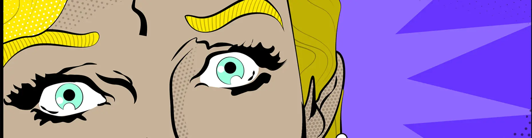
Pop Art Style
Psychedelic Poster Style
New Wave/Punk Style
The leaflet needed to be small enough to fit into a pocket, easily transportable. It had to include visually striking graphics for each style, historical key points, influential designers, and an infographic or timeline illustrating the evolution of these design styles. The design also needed to connect clearly with the Noroff brand.
Challenge
One of the biggest challenges was creating a visually striking and creatively folded leaflet, something out of the ordinary in terms of format. With such a diverse range of design styles, I had to ensure cohesion among the illustrations while maintaining each style’s individuality. I also needed to balance the creative folding with readability and ensure the leaflet fit into a small space, making it easy to carry.
Another challenge was the timeline, which needed to reflect overlapping periods in a non-traditional way, while also keeping the flow logical and clear despite the unusual layout.
Solution
To meet the brief, I created a unique folding design that gave the leaflet an unconventional, dynamic feel while remaining functional. The illustrations, inspired by the styles themselves, were unified using Noroff’s brand colours, making them visually cohesive yet representative of each period.
The timeline was integrated into the folds, reflecting the overlapping nature of the styles while offering a continuous visual flow.


Dieline for brochure here:
For the illustrations, I focused on integrating elements like typography to reflect the essence of each design style.
The unifying theme for the illustrations was inspired by the song “Papercut” by Linkin Park, symbolizing the sharp, impactful nature of each design style. This theme tied the four styles together, with each illustration reflecting the intensity and creativity of the era it represented.
I used Noroff’s brand colours to unify the styles visually, ensuring consistency while maintaining the individuality of each movement.
The result was a compact, informative, and visually engaging piece that tied back to Noroff’s brand identity.


